
The Psychology Behind High-Converting Landing Pages
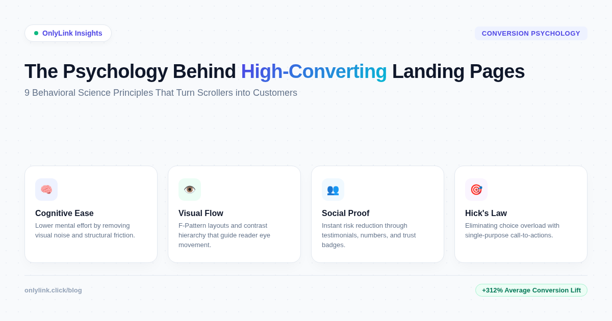
When a scroller clicks a link from your social media bio, email newsletter, or digital ad, what happens in their brain during those critical first few seconds?
Before they consciously read a single sentence of copy, evaluate your price, or weigh your product features, their brain has already executed thousands of subconscious calculations. Is this page safe? Is it easy to read? Does it match what I expected? Should I stay, or should I hit the back button?
According to behavioral psychologists, over 95% of human decision-making occurs in the subconscious mind. Yet most digital marketers, content creators, and small business owners design landing pages based on aesthetics or personal preference—ignoring the cognitive principles that actually drive human action.
The result? Up to 97% of website visitors bounce without taking action.
Understanding consumer psychology is the ultimate unfair advantage in digital marketing. When you align your page structure, visual contrast, typography, and copywriting with natural human decision-making patterns, conversions don’t happen by accident—they become predictable.
Here is the complete breakdown of the psychology behind high-converting landing pages, and how you can apply these 9 science-backed principles to your own digital front door.
The 4-Stage Psychological Conversion Funnel
To optimize your landing page for high conversion rates, you must first understand the mental sequence every visitor goes through from the instant they land to the moment they click your call-to-action (CTA).
Psychologists model this decision journey in four distinct stages:
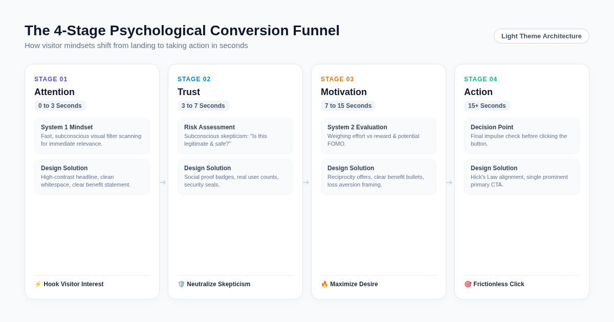
1. Attention Capture (0 to 3 Seconds)
- Brain State: Fast, instinctual processing (System 1).
- Goal: Hook the visitor and confirm relevance.
- Psychological Trigger: Visual clarity, bright light-theme breathing room, and a high-contrast headline that instantly answers “Am I in the right place?”
2. Trust Neutralization (3 to 7 Seconds)
- Brain State: Subconscious risk evaluation and skepticism filter.
- Goal: Overcome hesitation and validate safety.
- Psychological Trigger: Social proof badges, real user numbers, client logos, and clean, professional design standards.
3. Motivation Amplification (7 to 15 Seconds)
- Brain State: Deliberate value calculation (System 2).
- Goal: Maximize perceived reward relative to effort.
- Psychological Trigger: Benefit-focused copywriting, reciprocity offers, and ethical loss aversion framing.
4. Frictionless Action (15+ Seconds)
- Brain State: Final impulse check before taking action.
- Goal: Remove final barriers to click.
- Psychological Trigger: Single primary call-to-action button, clear directional visual cues, and zero decision paralysis.
9 Behavioral Science Principles That Drive Landing Page Conversions
1. Cognitive Ease & Light-Theme Visual Clarity
The Science
In Daniel Kahneman’s landmark psychological research (Thinking, Fast and Slow), Cognitive Ease describes the state of mental comfort experienced when processing information that is clear, familiar, and easy to read.
When a user lands on a visually cluttered or low-contrast dark page with unformatted walls of text, their brain experiences Cognitive Strain. Cognitive strain triggers immediate skepticism, frustration, and an instinctual urge to leave. Conversely, clean, light-themed layouts with ample white space, soft neutral card containers (#FFFFFF), and high-contrast typography (#0F172A) activate cognitive ease—making your offer feel instantly trustworthy, effortless, and premium.
How to Apply It
- Adopt clean, light-theme visual containers: Use crisp white cards set against soft neutral backgrounds (
#F8FAFC) to group related information cleanly. - Maintain high text contrast: Pair dark slate text with light backgrounds to maximize legibility on mobile screens under sunlight.
- Use generous spacing: Give headlines, subheadings, and buttons at least 20px–30px of visual padding so the brain isn’t overwhelmed.
2. Hick’s Law & The Elimination of Choice Overload
The Science
Formulated by psychologists William Edmund Hick and Ray Hyman, Hick’s Law states that the time it takes for a person to make a decision increases logarithmically with the number and complexity of choices presented.
When landing pages present visitors with 15 different equal-weighted links, social icons, sidebars, and pop-ups, visitors experience analysis paralysis. Overwhelmed by decision fatigue, the easiest action for the brain is to take no action at all.
| Number of Link Choices | Average Conversion Rate | Primary Visitor Behavior |
|---|---|---|
| 15+ Cluttered Links | 1.1% – 1.8% | High bounce rate, decision paralysis, lost attention |
| 8–10 Unorganized Links | 2.5% – 3.2% | Moderate friction, key links buried |
| 1 Primary CTA + 4–6 Categorized Links | 7.4% – 12.8% | Instant action, clear user pathways, zero overwhelm |
How to Apply It
- Establish one primary objective: Decide on the single most valuable action you want visitors to take (e.g., download a lead magnet, book a consultation, buy a featured product).
- Feature your main offer: Give your top priority link a distinct, high-contrast button design with an accent color, while keeping secondary links clean and simple.
- Organize secondary links into Collections: If you must offer multiple links, group them into collapsible categories so the main view remains uncluttered.
3. Visual Eye-Tracking Pathways (F-Pattern & Z-Pattern)
The Science
Eye-tracking studies by the Nielsen Norman Group reveal that digital scrollers do not read web pages line by line like a book. Instead, their eyes follow predictable visual scanning routes based on layout architecture:
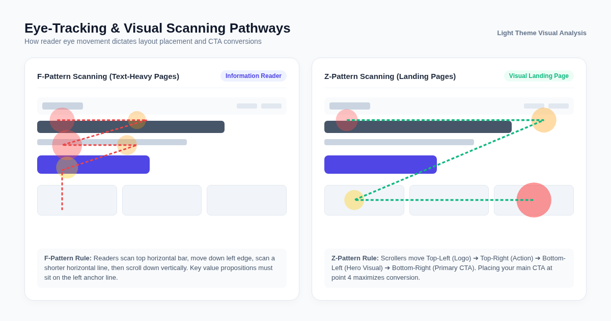
- F-Pattern (Text-Heavy Content): Readers scan horizontally across the top, drop down the left margin, scan a shorter horizontal section, and then sweep vertically down the left edge.
- Z-Pattern (Landing Pages & Bio Links): Scrollers scan from Top-Left (Logo/Profile Avatar) ➔ Top-Right (Navigation/Status) ➔ Bottom-Left (Hero Headline & Visual) ➔ Bottom-Right (Primary Call-to-Action).
How to Apply It
- Anchor key copy to the left edge: In F-pattern layouts, place your core value proposition and key bullet points along the left visual axis where eyes naturally scan.
- Position your primary CTA at Z-pattern terminal points: In visual landing pages, place your high-contrast action button at the bottom-right or center-bottom of the primary hero block.
- Use directional visual cues: Incorporate subtle directional arrows or pointing emojis (👇, ➡️) to guide the reader’s gaze directly toward your click button.
4. Social Proof & The Bandwagon Effect
The Science
Rooted in Robert Cialdini’s 6 Principles of Persuasion, Social Proof dictates that when people are uncertain about a decision, they look to the actions and behaviors of others to guide their choices.
Humans are fundamentally social creatures. We subconsciously assume that if thousands of people are using a tool, buying a course, or reading a newsletter, it must be valuable and safe.
Types of Social Proof That Boost Conversions
- Numerical Validation: “Joined by 50,000+ creators worldwide” or “Over 1,200 5-star reviews”.
- Peer Testimonials: Short, authentic quotes with real names and avatar photos placed directly near the call-to-action.
- Authority Badges: Media mentions (“Featured on Forbes, TechCrunch, Wired”), security certifications, or official platform partnership badges.
- Real-Time Activity Indicators: Small notifications highlighting recent purchases or signups.
How to Apply It
Place a compact social proof banner or star rating directly above or below your primary CTA button. This places risk reduction right at the exact moment of decision.
5. The Von Restorff Effect (The Isolation Effect)
The Science
Discovered by German psychiatrist Hedwig von Restorff in 1933, The Von Restorff Effect predicts that when multiple similar items are presented together, the item that differs visually from the rest is the most likely to be remembered and clicked.
If every button on your landing page has the exact same white background, grey border, and font size, none of them stand out. The human brain treats them as a uniform grid, reducing click-through rates.
How to Apply It
- Isolate your primary CTA: Give your primary button a bold, high-contrast color (such as vibrant indigo
#4F46E5, emerald green#10B981, or electric violet#8B5CF6) that isn’t used anywhere else on the page. - Incorporate subtle visual weight: Add soft drop shadows (
box-shadow: 0 10px 25px -5px rgba(79, 70, 229, 0.3)) or pulsing micro-animations to draw natural visual focus to the target button.
6. Prospect Theory & Ethical Loss Aversion
The Science
Developed by Nobel Prize winners Daniel Kahneman and Amos Tversky, Prospect Theory proves that the psychological pain of losing something is twice as powerful as the pleasure of gaining an equivalent reward.
Phrased simply: humans are far more motivated to avoid losing $100 than they are to gain $100.
Framing Comparison
- ❌ Gain Framing (Low Urgency): “Sign up today to get our weekly marketing tips.”
- ✅ Loss Aversion Framing (High Urgency): “Stop losing 50% of your profile visitors. Get the free guide to fix your bio link today.”
How to Apply It
- Highlight the cost of inaction: Remind visitors what they miss out on, lose, or waste by ignoring your solution (e.g., lost time, wasted ad spend, missed sales).
- Use ethical urgency & scarcity: If your offer has limited stock, a deadline, or capped consultation spots, state it clearly (“Only 5 strategy call slots remaining for this week”).
7. The Reciprocity Principle
The Science
Another pillar of behavioral psychology, The Reciprocity Principle, dictates that when someone receives a gift, favor, or valuable resource for free, they feel a natural psychological obligation to return the favor.
If your landing page immediately demands a credit card purchase or a long 10-field form commitment before offering any value, visitors erect defensive walls. But when you provide immense value upfront for free, visitor trust soars.
High-Converting Reciprocity Lead Magnets
- Free 5-Minute Strategy Checklist or Template
- Instant Video Demo or Audio Sample
- Free Interactive Calculator or Tool Access
- 10% Instant Welcome Discount Code
How to Apply It
Offer a friction-free lead magnet at the top of your bio link page. Once visitors receive instant value, they are significantly more likely to convert into paid customers down the road.
8. Anchor Pricing & The Decoy Effect
The Science
When evaluating prices or offer value, the human brain cannot calculate absolute value in a vacuum. Instead, it relies on anchoring—evaluating prices relative to the first reference point encountered.
Furthermore, by introducing a third “decoy” option that is intentionally less attractive than your target package, you make your preferred package look like an irresistible bargain (a phenomenon known as the Asymmetric Dominance Effect).
Practical Example
Imagine offering a digital course:
- Option A (Standard): $49 for the eBook only.
- Option B (Decoy): $149 for the Video Masterclass only.
- Option C (VIP Bundle - Target): $149 for the Video Masterclass + eBook + Template Pack + Private Community Access.
When presented next to Option B, Option C feels like an extraordinary deal, dramatically shifting purchases toward the higher-tier bundle.
9. Micro-Commitments & The Zeigarnik Effect
The Science
The Zeigarnik Effect proves that the human brain experiences psychological tension when a task is left incomplete—creating a strong desire to finish what was started.
Additionally, behavioral research shows that getting a user to say “Yes” to a tiny, zero-risk micro-commitment (like clicking an interactive quiz button or selecting an option) increases their likelihood of completing a larger commitment (like entering an email or buying a product) by up to 300%.
How to Apply It
Instead of overwhelming visitors with a long, intimidating form right on the landing page, break the conversion process into 2 simple steps:
- Step 1 (Micro-Commitment): Ask a single tap question (e.g., “What is your #1 marketing goal?” with 3 simple option buttons).
- Step 2 (Completion): Reveal the personalized result in exchange for their email address.
Psychological Audit: Low-Converting vs. High-Converting Landing Page
To see how these 9 behavioral principles transform a landing page in practice, compare these two real-world design approaches:
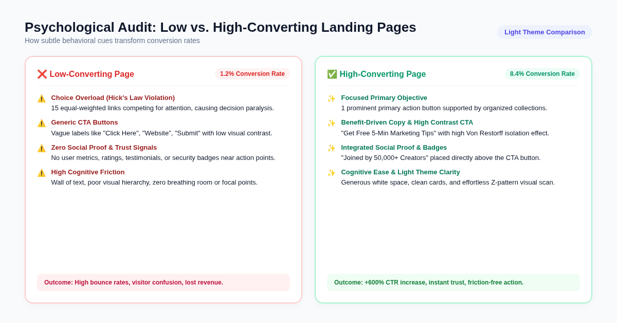
| Psychological Element | ❌ Low-Converting Landing Page | ✅ High-Converting Landing Page |
|---|---|---|
| Visual Architecture | Heavy dark contrast, cluttered text walls, high cognitive friction | Clean light-theme cards, ample white space, effortless Z-pattern scan |
| Decision Focus | 15+ competing equal links violating Hick’s Law | 1 highlighted primary offer + organized collections |
| CTA Copywriting | Generic labels (“Submit”, “Click Here”, “Website”) | Benefit-driven copy ("📩 Get Free 5-Min Marketing Tips") |
| Visual Isolation | Buttons blend into background graphics | High Von Restorff contrast button with glowing accent shadow |
| Trust Building | Zero social proof or reviews near action buttons | Integrated user metrics (“Joined by 50,000+ creators”) |
| Value Framing | Feature lists without emotional connection | Loss aversion & reciprocity framing upfront |
| Mobile Speed | Slow 4s+ load time causing 50% bounce rates | Sub-500ms instant load on light-weight bio link architecture |
7-Step Checklist for Auditing Your Landing Page Psychology
Before launching your next marketing campaign or social media push, run your page through this rapid psychology audit:
- 1. The 3-Second Test: Can a new visitor immediately state who you help and what action to take within 3 seconds of landing?
- 2. Hick’s Law Alignment: Is there one primary call-to-action button that visually dominates the page?
- 3. Light-Theme Cognitive Ease: Does your page use clean typography, soft neutral card backgrounds, and generous spacing to prevent mental strain?
- 4. Social Proof Placement: Have you placed testimonial badges, review stars, or user count numbers within 50px of your main action button?
- 5. Benefit-Focused CTA Copy: Does your button copy state the specific benefit of clicking (rather than a generic command like “Submit”)?
- 6. Directional Visual Flow: Do visual elements, spacing, or pointing emojis naturally lead the scroller’s eye down to the CTA?
- 7. Mobile Friction Elimination: Does your page load in under 1 second on mobile devices without layout shifts?
Build High-Converting Bio Landing Pages with OnlyLink
Applying complex consumer psychology to your landing pages doesn’t require hiring an expensive conversion rate optimization (CRO) agency or writing thousands of lines of custom code.
With OnlyLink, creators, freelancers, and small businesses can build stunning, high-converting bio link landing pages in less than 60 seconds.
Why OnlyLink Pages Convert Better:
- ⚡ Lightning-Fast Performance: Built on ultra-lightweight, server-rendered infrastructure that loads in under 300 milliseconds.
- 🎨 Psychology-Backed Light Themes: Curated color palettes, crisp white card containers, and high-contrast button styling built for maximum cognitive ease.
- 🎯 Hick’s Law Layouts: Highlight your primary offer, group secondary links into clean collections, and embed rich media without visual clutter.
- 📊 Real-Time Analytics: Track click-through rates (CTR), conversion pathways, and audience insights live from your dashboard.
Ready to transform your profile traffic into real business results?
👉 Create Your Free OnlyLink Page Now and claim your custom handle before someone else does!
Ready to build your link in bio?
Create your free OnlyLink page in under a minute unlimited links, analytics and custom designs.
Get started freeKeep reading
QR Codes 101: Bringing Your Bio Link Offline
Learn how QR codes can bridge your offline presence with your online bio link. Discover where to use QR codes, …
Glassmorphism, Gradients, and Wallpapers: Bio Page Design Trends for 2026
Explore the top bio page design trends dominating 2026 — glassmorphism effects, gradient color palettes, and …