Link-in-Bio Mistakes That Are Costing You Clicks
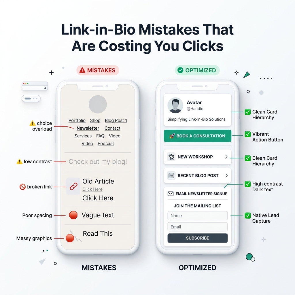
You spend hours scripting engaging short-form videos, designing polished graphics, writing high-converting captions, and building an authentic social media audience on Instagram, TikTok, LinkedIn, YouTube, and X.
Yet, when casual scrollers land on your profile and tap your link in bio, what happens next?
For millions of creators, freelancers, e-commerce brands, and digital entrepreneurs, this is where the traffic leak occurs.
Your link-in-bio page is the single most valuable digital bridge connecting your social media impressions to real business outcomes—your e-commerce store, newsletter signups, client consultation bookings, digital product sales, or podcast streams.
However, simple setup errors, poor visual hierarchy, low contrast, and unorganized button lists can quietly drain your Click-Through Rate (CTR) by up to 70%.
If you are getting high profile visits but frustratingly low link clicks, your page is likely committing critical conversion errors. In this comprehensive 2026 guide, we break down the top link-in-bio mistakes that are costing you clicks—and show you how to fix them using modern, high-contrast light-theme visual design principles.
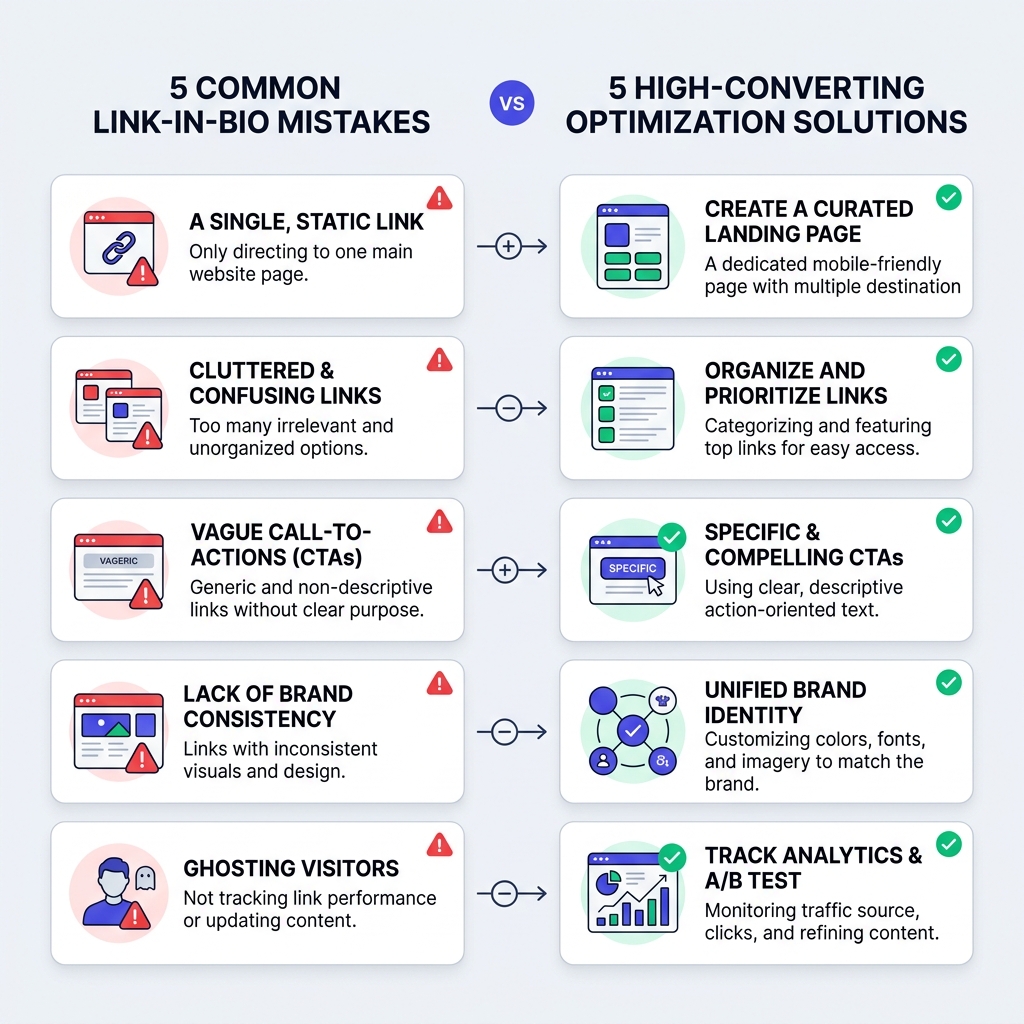
5 Common Link-in-Bio Mistakes vs. High-Converting Solutions
Before diving into the detailed breakdown, examine the comparison matrix illustrating how strategic UI choices transform a low-converting bio page into a high-converting digital front door:
Mistake 1: Choice Overload & The Hick’s Law Trap (The 20-Button Wall)
The Mistake
Piling 15 to 30 identical, unorganized link buttons onto your page, expecting mobile visitors to scroll through a never-ending wall of choices.
In behavioral psychology, Hick’s Law states that the time required to make a decision increases logarithmically with the number and complexity of options. When mobile scrollers tap your bio link and encounter 20 identical buttons with equal visual weight, cognitive friction spikes. Facing decision paralysis, the most common action is tapping the back button without clicking anything.
The Fix
- Adhere to the Rule of 5 to 7: Limit your primary top-level action items to 5–7 high-priority cards.
- Group Secondary Links into Collections: Move secondary resources (archived blog posts, affiliate discounts, or past podcast episodes) into clean, collapsible dropdown folders.
- Establish a Single Hero Spotlight: Position your #1 primary campaign (e.g., your new product launch, free e-book, or course enrollment) at the very top with a distinct high-contrast card style.
Mistake 2: Passive, Vague Call-to-Actions (CTAs)
The Mistake
Labeling your bio page buttons with vague, single-word nouns like “Website”, “Store”, “Podcast”, or “My Blog”.
Visitors do not click on buttons simply because they exist; they click because of what specific value or benefit awaits them on the other side. Passive labels force users to guess what they will find, severely dampening click motivation.
The Fix
Transform passive micro-copy into action-oriented, outcome-focused action triggers:
| Passive & Weak CTA (Low CTR) | Actionable & High-Converting CTA (High CTR) |
|---|---|
| ❌ Newsletter | ✅ Get Free Weekly 5-Minute Creator Tips 📩 |
| ❌ Store | ✅ Shop 20% Off Fall Apparel Drop 🛍️ |
| ❌ YouTube | ✅ Watch: 10-Min Studio Design Tour 📹 |
| ❌ My Podcast | ✅ Listen to Ep. 45: How to Scale Social Traffic 🎙️ |
| ❌ Book Call | ✅ Reserve Your Free 15-Min Strategy Session 📅 |
Mistake 3: Outdated Dark or Low-Contrast Visual Design
The Mistake
Using dark, muddy background themes with low-contrast gray text on dark buttons that are difficult to read—especially on mobile devices outdoors under sunlight.
While dark themes are popular in code editors, clean light-theme design systems remain the industry gold standard for high-converting SaaS landing pages, executive portfolios, and premium bio link hubs.
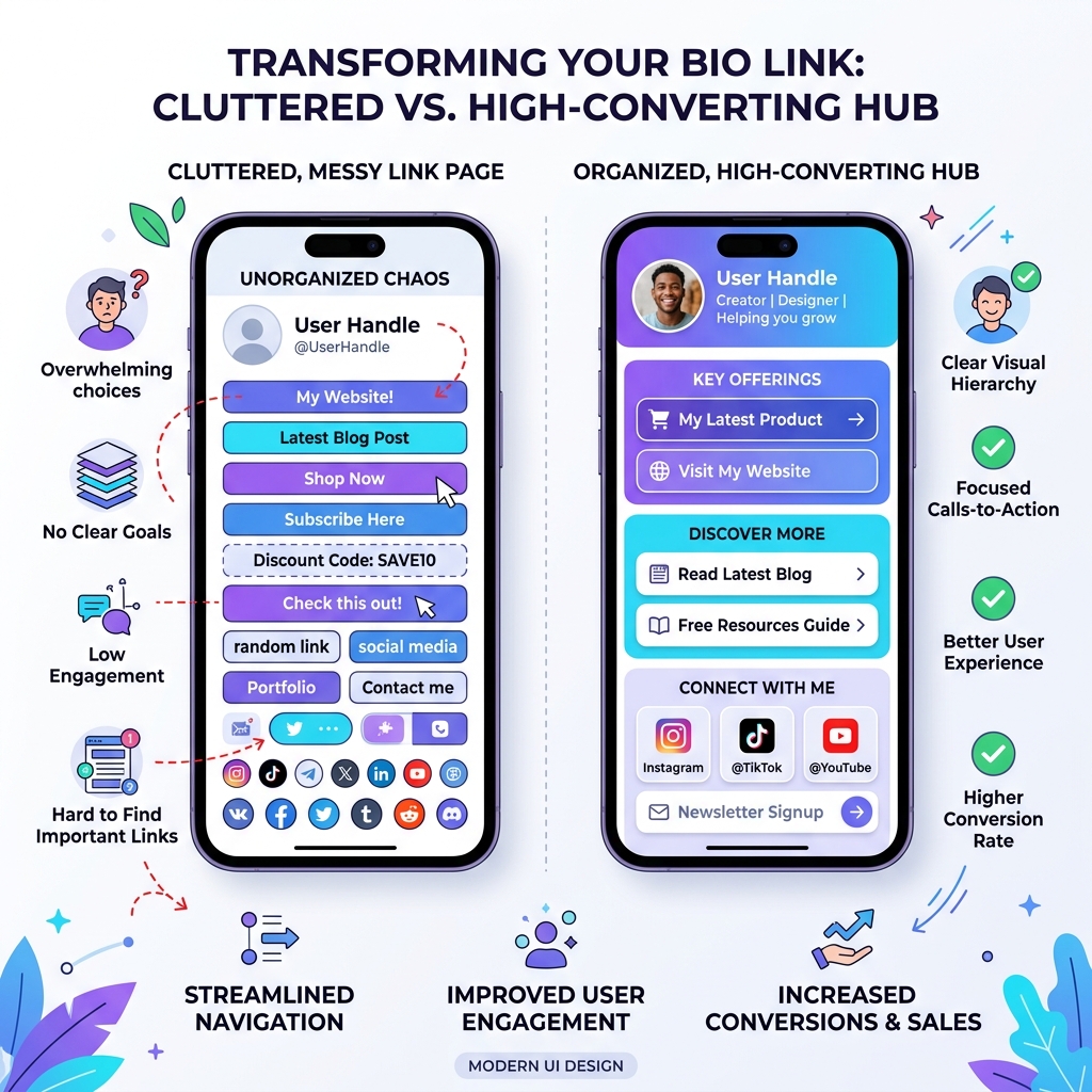
The Fix: Why Light-Theme Visual Aesthetics Drive Higher CTRs
WCAG AAA Contrast Compliance: Deep charcoal typography (
#0F172Aor#1E293B) set against crisp white (#FFFFFF) or soft off-white (#F8FAFC) surfaces provides maximum legibility under any lighting condition.Subtle Elevation & Card Separation: Light backgrounds allow you to use soft drop shadows (
0 4px 6px -1px rgba(0,0,0,0.05)) and subtle borders (1px solid #E2E8F0). This creates distinct, touch-friendly card containers that feel tactile on mobile touchscreens.Strategic Accent Highlights: On a clean light canvas, vibrant accent colors like royal indigo (
#4F46E5), emerald green (#10B981), or electric cyan (#0EA5E9) immediately draw the eye to your top primary CTA.
[!IMPORTANT] Light-Theme UX Rule: Always maintain at least a 4.5:1 color contrast ratio between button text and button background. Never use pale gray text on white buttons.
Mistake 4: External Redirect Friction (Forcing Multi-Page Hops)
The Mistake
Sending visitors through multiple external redirects just to perform simple actions—like filling out an email signup form or previewing a video.
Every time a user has to leave your bio page, open a separate browser tab, wait for a heavy desktop website to load, and fill out a multi-field form, conversion rates drop by 20% per additional hop.
The Fix
Use native, in-page embeds supported by modern bio tools like OnlyLink:
- Native In-Page Lead Capture: Embed email signup forms directly on your bio hub so visitors subscribe without leaving the page.
- Playable Video & Audio Embeds: Allow users to play YouTube videos or Spotify tracks right inside the bio page.
- 1-Click Booking Integration: Embed Calendly or Cal.com consultation slots directly inside a card container.
Mistake 5: Neglecting Mobile Speed & Performance Optimization
The Mistake
Using bloated bio tools laden with heavy third-party tracking scripts, uncompressed full-res images, and sluggish render speeds.
Over 95% of social media bio link traffic originates on mobile devices using cellular networks (5G/4G). If your bio link takes longer than 2 seconds to load, more than 50% of visitors bounce before the page even renders.
The Fix
- Use Sub-Second Static Platforms: Build your page on fast platforms like OnlyLink, which deliver sub-second (<400ms) mobile page loads.
- Optimize Image Formats: Use web-optimized WebP or compressed PNG avatars and thumbnails.
- Eliminate Unnecessary Scripts: Keep the DOM lightweight for instant mobile responsiveness.
Mistake 6: Mismatch Between Social Content & Bio Page Spotlight
The Mistake
Publishing an Instagram Reel, TikTok video, or LinkedIn post directing followers to check out a specific new resource, while your bio page top button still features a campaign from three months ago.
When followers land on your bio link and cannot find the exact resource mentioned in your video within 3 seconds, they feel misled and leave immediately.
The Fix
- Rotate the Top Spotlight Card: Keep your #1 featured card synchronized with your daily or weekly content drops.
- Use Scheduled Links: Set start and end dates for promotional CTAs so time-sensitive links vanish automatically when sales end.
Mistake 7: Operating Blind Without Real-Time Analytics
The Mistake
Setting up your bio page once and never reviewing click analytics to see which links are performing and which buttons sit untouched.
Without real-time data, you cannot optimize your visual hierarchy, refine micro-copy, or prune dead weight.
The Fix
Review your OnlyLink click heatmaps and analytics monthly:
- Identify Dead Weight: Remove or group links receiving <1% of total clicks.
- Track Top Performers: Move high-performing links higher up the visual page hierarchy.
- Monitor Referrer Sources: See whether your clicks originate from Instagram, TikTok, LinkedIn, or YouTube.
Comparison Matrix: Low-Converting Page vs. Optimized Light-Theme Hub
| Performance Metric | Low-Converting Cluttered Page | High-Converting Light-Theme Hub |
|---|---|---|
| Number of Links | 15–30 unorganized buttons | 5–7 curated primary cards + collapsible folders |
| CTA Micro-Copy | Passive nouns (“Website”, “Store”) | Action & benefit-driven copy (“Shop 20% Off Drop”) |
| Visual Styling | Dark, low-contrast, ad-laden feed | WCAG AAA light-theme design with crisp contrast |
| Lead Capture | Multi-hop redirect to desktop site | Native 1-click in-page email opt-in form |
| Mobile Speed | 2.5s - 4.0s heavy loading | Sub-second render (<400ms) |
| Average CTR | 1.5% - 2.5% | 10.5% - 18.2%+ |
What to Fix Today: The 5-Minute Bio Link Audit
Take five minutes right now to audit your profile link:
- 1. Prune the Button Wall: Reduce your top-level links to 5–7 primary items.
- 2. Upgrade Micro-Copy: Replace passive single-word button labels with clear, benefit-driven CTAs.
- 3. Verify Light Theme Contrast: Ensure text is deep slate (
#0F172A) against clean white/off-white card containers. - 4. Enable In-Page Lead Capture: Replace external form links with a native email opt-in box.
- 5. Test Mobile Render Speed: Open your link on a mobile device to verify sub-second load times.
Related Bio Link Strategy Guides
Explore more strategies on the OnlyLink blog:
- How Often Should You Update Your Link-in-Bio Page?
- When to Refresh Your Bio Link (And What to Change)
- The Anatomy of a High-Converting Link-in-Bio Page
- 10 Ways to Get More Clicks from Your Instagram Bio
- How to Organize Multiple Social Links Without Confusing Visitors
Stop Losing Bio Link Clicks Today
Your link in bio is the digital front door to your business. Eliminating choice overload, refining micro-copy, enabling native embeds, and choosing a clean light-theme visual design guarantees you capture every drop of high-intent social media traffic.
Ready to build a high-converting, light-themed bio page in under a minute? Create your free OnlyLink profile today and transform your social media traffic into real business growth.
Ready to build your link in bio?
Create your free OnlyLink page in under a minute unlimited links, analytics and custom designs.
Get started freeKeep reading
The Ultimate Link-in-Bio Guide for TikTok Creators
Master your TikTok bio strategy, convert short-form video views into sales, build an owned audience, and …
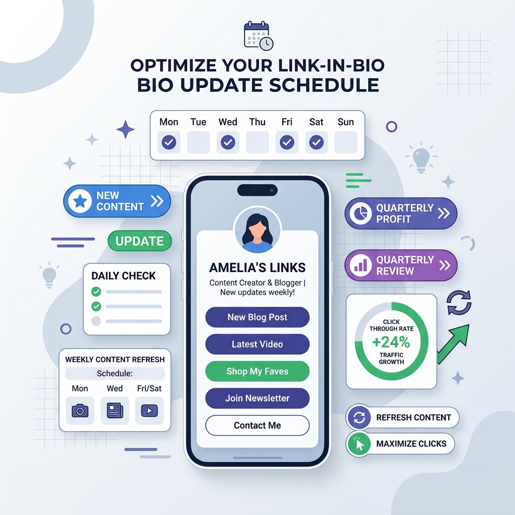
How Often Should You Update Your Link-in-Bio Page?
Discover the ideal update frequency for your link-in-bio page based on your creator persona, content output, …