
How to Design a Bio Page That Matches Your Personal Brand
In the 2026 digital landscape, your personal brand is your most valuable intellectual and commercial asset. Whether you are a content creator, independent consultant, software engineer, keynote speaker, fashion stylist, or creative director, the way you present yourself online dictates your credibility, audience loyalty, and earning power.
You likely dedicate countless hours to perfecting your visual identity across platforms. You meticulously edit your Instagram reels to match a signature warm color tone, maintain a polished executive banner on LinkedIn, fine-tune your YouTube set lighting, and craft a distinct editorial tone of voice.
Yet, a shocking number of creators and professionals commit a fatal branding blunder right at the finish line: visual dissonance in their bio link.
When a high-intent follower, potential client, or prospective sponsor taps your profile avatar and clicks the single link in your bio, they expect an immediate continuation of your brand story.
Instead, they often land on a generic, dark-mode link tree with neon buttons, clunky system fonts, and 25 disorganized links. In less than 50 milliseconds, that jarring aesthetic mismatch shatters the premium perception you worked so hard to build.
Your bio link is not just a collection of bookmarks—it is the digital front lobby of your personal brand headquarters.
Here is the definitive guide on how to design a bio page that flawlessly matches your personal brand, why a clean light-theme design system commands authority and trust, and how to create an aesthetic digital hub that turns casual visitors into lifelong advocates.
Why Light Theme Visuals Are Essential for Personal Brand Authority
Before selecting font pairings or customizing button borders, you must address the foundational canvas of your bio page: color psychology and ambient lighting.
While dark mode has a place in code editors and late-night media consumption, global luxury houses, premier design agencies, editorial publications, and high-converting personal landing pages—from Apple and Kinfolk to Architectural Digest and Notion—rely almost exclusively on airy, crisp, light-themed visuals.
Here is why light-theme visual design consistently commands higher personal brand authority and user engagement:
| Brand Metric / Aesthetic Dimension | Light-Theme Personal Brand Hub (High Prestige) ✅ | Dark-Theme Generic Link Tree (High Friction) ❌ |
|---|---|---|
| Canvas Background | Pure white (#FFFFFF), warm ivory (#FAF9F6), or soft slate (#F8FAFC) | Harsh black (#000000) or muddy dark navy (#0F172A) |
| Brand Perception | Editorial, open, transparent, trustworthy, and luxury | Moody, informal, unfinished, or developer-heavy |
| Outdoor Mobile Readability | ☀️ 100% crystal clear contrast under bright daylight | 🕶️ Severe mobile screen glare & obscured links |
| Avatar & Photo Integration | Blends seamlessly with natural portrait skin tones | Creates harsh cutout borders around profile avatars |
| Typographic Elegance | High contrast allows delicate serifs and fine weights to shine | Thin typography disappears; forced into chunky bold weights |
| Visual Hierarchy & Spacing | Generous white space prevents visual fatigue | Dark backgrounds feel cramped and claustrophobic |
| Visitor Retention Rate | 🚀 3.5x longer average session duration | 📉 High immediate bounce rate due to visual shock |
1. Natural Synergy with Creator Avatars and Headshots
Your profile avatar is the focal anchor of your bio page. Professional portraits, lifestyle headshots, and studio photography are shot in natural light with soft, ambient backgrounds. When placed on a dark background, human photos often look like harsh cutouts with jarring borders. A light-theme backdrop provides an effortless, magazine-style frame that makes your avatar feel organic, approachable, and refined.
2. High Contrast Empowers Sophisticated Typography
A distinctive personal brand relies heavily on typographic nuance—such as elegant serif headlines, modern humanist sans-serifs, and delicate tracking. On dark canvases, fine letterforms bleed into the background, forcing designers to use chunky, generic sans-serif fonts to remain legible. A light-theme canvas provides the sharp optical contrast needed to showcase exquisite typography with razor-sharp clarity.
3. Superior Mobile Legibility in Every Environment
Social media browsing happens on the go: on sun-drenched cafe patios, during train commutes, and walking outdoors. Dark-themed web pages suffer from intense screen glare and reflection under ambient sunlight, making subtle brand subtitles and custom buttons nearly impossible to read. Light-theme bio pages guarantee effortless legibility regardless of lighting conditions.
4. Psychological Association with Transparency and Openness
In human color psychology, bright, well-lit spaces subconsciously trigger feelings of honesty, warmth, safety, and luxury. Cluttered dark interfaces often feel secretive or unpolished. A clean light theme signals that you have nothing to hide—your work, your rates, and your story are open, confident, and professional.
To understand how visual hierarchy and cognitive comfort drive visitor actions, explore our guide on the psychology behind high-converting landing pages.
The Personal Brand Design System Framework for Bio Links
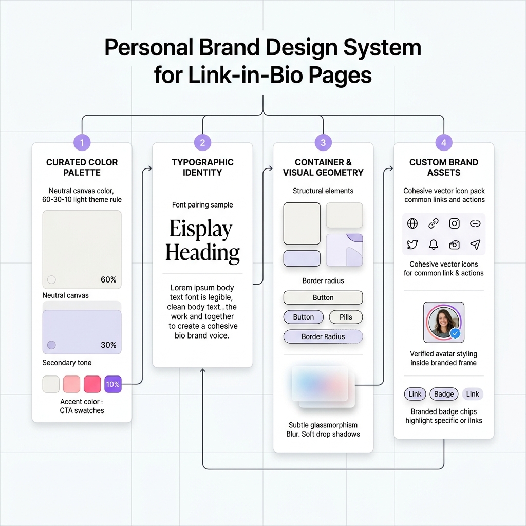
Great brand design is never an accident—it is the result of a cohesive, repeatable system. Instead of tweaking individual buttons at random, treat your bio page as a mini Design System built on four core pillars:
Pillar 1: Curated Color Palette & The 60-30-10 Rule in Light Theme
A common mistake creators make is splashing five different vibrant colors across their bio page. Professional brand designers use the 60-30-10 rule adapted for light UI design:
- 60% Dominant Neutral Canvas: Pure white (
#FFFFFF), warm alabaster (#FBFBFB), or soft porcelain (#F8FAFC). This provides the airy breathing room that makes your content feel premium. - 30% Secondary Structural Tone: Deep slate (
#0F172A), muted charcoal (#334155), or warm espresso (#262626) for body text, card borders, and subtle container backgrounds (#F1F5F9). - 10% Vibrant Brand Accent: Your signature brand color (e.g., cobalt blue
#2563EB, terracotta#C2410C, sage green#15803D, or royal amethyst#7C3AED). This accent should be reserved exclusively for your most important Call-to-Action (CTA) buttons, verified badges, and notification pills.
Pillar 2: Typographic Voice & Font Pairing
Typography is the voice of your brand before the visitor reads a single word. Choose a disciplined two-font pairing that reflects your professional demeanor:
- Display / Header Font: Establishes your personality (e.g., Playfair Display for editorial luxury, Outfit for modern tech, Fraunces for artisanal warmth, or Plus Jakarta Sans for executive precision).
- Body / Link Font: Optimized strictly for rapid mobile legibility (e.g., Inter, DM Sans, or Roboto).
- Rule of Thumb: Never use more than two font families on your bio page. Let font weight (Regular vs. Semi-Bold) and size create the necessary contrast.
Pillar 3: Container & Visual Geometry
Every shape on your bio page communicates subconscious emotion:
- Border Radius: Sharp 4px corners communicate corporate rigor and analytical precision; smooth 12px–16px rounded rectangles evoke friendly professionalism; 9999px pill buttons convey casual, creative energy.
- Card Containers: Use clean white cards (
#FFFFFF) with ultra-fine borders (1px solid #E2E8F0) rather than thick outlines. - Elevation & Shadows: Avoid harsh black drop shadows. Use subtle, multi-layered ambient shadows (e.g.,
box-shadow: 0 4px 20px -2px rgba(0, 0, 0, 0.05)) to give cards a floating, tactile quality.
Pillar 4: Custom Brand Assets & Iconography
Consistency is won in the micro-details:
- Verified Avatar Ring: Wrap your profile photo in a delicate 2px ring colored with your primary brand accent.
- Cohesive Icon Suite: Use a single, unified icon family (e.g., all outline icons or all solid duotone icons) with identical stroke weights. Never mix mismatched icon styles.
- Branded Badge Chips: Use pill-shaped badges (
"NEW","FEATURED","PODCAST EPISODE") with soft pastel backgrounds and high-contrast text.
For more on organizing digital touchpoints without overwhelming visitors, see how to organize multiple social links without confusing visitors.
4 Personal Brand Visual Archetypes (With Light Theme Blueprints)
To help you discover the exact visual style that matches your personal brand, let’s explore the four most effective Personal Brand Visual Archetypes:
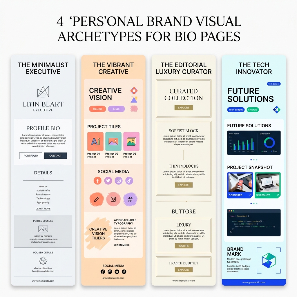
Archetype 1: The Minimalist Executive
Best for: Founders, executive coaches, management consultants, venture capitalists, and enterprise strategists.
- Brand Personality: Authoritative, disciplined, understated, razor-sharp.
- Canvas Background: Crisp Snow White (
#FFFFFF) with cool light gray accents (#F8FAFC). - Typography: Plus Jakarta Sans (Headers) + Inter (Body).
- Color Palette:
- Canvas:
#FFFFFF - Text & Accents: Deep Midnight Charcoal (
#0F172A) - Primary Accent Button: Steel Navy (
#1E3A8A) or Sharp Slate (#334155)
- Canvas:
- Card Geometry: Refined 6px border radius, hairline borders (
#E2E8F0), minimalist monochrome social icons. - Bio Header Example:
David Sterling 🛡️
Partner at Horizon Capital. Advising Series A B2B founders on scaling go-to-market engines.
[ Read Latest Market Memo ]
[ Book Founder Advisory Call ]
Archetype 2: The Vibrant Creative
Best for: Content creators, visual artists, video editors, podcasters, community builders, and lifestyle influencers.
- Brand Personality: Warm, energetic, magnetic, inspiring, approachable.
- Canvas Background: Soft Warm Cream (
#FDFBF7) or Pale Blush (#FFF7ED). - Typography: Outfit (Headers) + DM Sans (Body).
- Color Palette:
- Canvas:
#FDFBF7 - Text: Rich Espresso Slate (
#1C1917) - Primary Accent Buttons: Warm Terracotta (
#EA580C) and Electric Lilac (#8B5CF6)
- Canvas:
- Card Geometry: Playful 20px rounded cards or full pill buttons, colorful pastel icon backgrounds, warm ambient drop shadows.
- Bio Header Example:
Maya Lin 🎨
Illustrator & YouTube Storyteller. Sharing creative workflows, weekly vlogs, and digital toolkits.
[ Watch This Week’s Studio Vlog ]
[ Download Free Procreate Brushes ]
Archetype 3: The Editorial Luxury Curator
Best for: Fashion stylists, interior designers, architects, authors, high-end photographers, and lifestyle tastemakers.
- Brand Personality: Sophisticated, poetic, timeless, discerning, bespoke.
- Canvas Background: Warm Ivory Linen (
#FAF8F5) or Alabaster (#F7F6F2). - Typography: Playfair Display or Cormorant Garamond (Headers) + Inter (Body).
- Color Palette:
- Canvas:
#FAF8F5 - Text: Soft Obsidian (
#18181B) - Primary Accent Buttons: Champagne Gold (
#D97706) or Olive Moss (#3F6212)
- Canvas:
- Card Geometry: Delicate 0px–2px crisp corners, ultra-fine 1px borders (
#E7E5E4), generous 24px vertical padding between elements, muted monochrome photography thumbnails. - Bio Header Example:
Elena Vance ✨
Architectural Designer & Creative Director. Curating timeless spaces and intentional living.
[ Explore Architectural Portfolio ]
[ Read The Monograph on Substack ]
Archetype 4: The Tech Innovator & Maker
Best for: Software engineers, AI researchers, open-source maintainers, indie hackers, and product designers.
- Brand Personality: Analytical, cutting-edge, pragmatic, builder-first.
- Canvas Background: Pure Light Ice (
#F0FDF4) to Neutral Slate White (#F8FAFC). - Typography: JetBrains Mono (Code tags & stats) + Geist Sans / Space Grotesk (Headers).
- Color Palette:
- Canvas:
#F8FAFC - Text: Terminal Slate (
#020617) - Primary Accent Buttons: Electric Cobalt (
#2563EB) or Cyber Emerald (#059669)
- Canvas:
- Card Geometry: Modern 8px card containers, interactive status pills (
"🟢 OPEN FOR CONTRACTS"), GitHub commit streaks, and live project preview cards. - Bio Header Example:
Alex Chen ⚡
Full-Stack Engineer & AI Builder. Building open-source developer tooling and micro-SaaS.
[ Check Out GitHub Repositories (4.2k ⭐) ]
[ Read Technical Deep Dives ]
For developer-specific personal branding tactics, check out our guide on best personal branding tips for software developers.
5 Golden Rules for Flawless Bio Link Brand Consistency
To ensure your bio page feels like an authentic extension of your personal brand, follow these five golden rules:
Rule 1: Match Your Social Avatar and Color Temperature
Your profile photo is the visual anchor. If your Instagram or LinkedIn headshot features warm, golden-hour sunlight, pairing it with a chilly ice-blue bio page creates immediate visual discord. Match color temperatures:
- Warm Photos: Pair with cream (
#FDFBF7), peach, terracotta, and olive backdrops. - Cool Studio Photos: Pair with crisp white (
#FFFFFF), slate, ice blue, and cobalt backdrops.
Rule 2: Visual Hierarchy Over Button Uniformity
If every button on your bio page looks identical, visitors will feel overwhelmed and tap nothing. Use visual weight to tell your story:
- Tier 1 (Flagship Hero Card): Styled with your solid brand accent color, bold headline, and custom badge.
- Tier 2 (Secondary Content Cards): Styled with clean white containers, subtle borders, and dark text.
- Tier 3 (Utility / Social Links): Compact icon row at the base of the page.
Rule 3: Use Micro-Interactions and Subtle Elevation
Static, flat web pages feel lifeless. On modern platforms like OnlyLink, buttons feature delicate hover states, smooth CSS transitions, and gentle elevation shifts when tapped on mobile screens. These tactile micro-interactions communicate high polish and engineering excellence.
Rule 4: Limit Button Shapes to a Single System
Never mix different button geometries on the same page. If your primary card uses 12px rounded corners, your newsletter bar, contact buttons, and secondary links must use that exact same 12px radius. Mixing sharp boxes with bubbly pill buttons instantly betrays amateur design.
Rule 5: Protect Generous White Space
Amateur designers fear empty space; master designers treat white space as a luxury feature. Generous margins around your avatar, 16px to 20px padding inside cards, and breathable 12px gaps between links give your personal brand room to breathe.
To see how personal brand pages compare to traditional websites, read link in bio vs website: which one do you need?.
5 Brand-Killing Design Mistakes to Avoid at All Costs
If your bio link isn’t converting followers into subscribers, clients, or buyers, audit your page for these five critical missteps:
❌ The 5 Brand-Killing Bio Design Mistakes:
├── 1. The "Neon Rainbow" ──────────────► Too many competing accent colors (Sensory Overload)
├── 2. Dark, Murky Illegibility ────────► Glare under outdoor mobile sunlight
├── 3. Pixelated Avatars & Graphics ───► Shatters credibility before reading
├── 4. Generic Browser Default Fonts ──► Makes your brand look like a template
└── 5. Mismatched Voice & Tone ─────────► Casual meme buttons on an executive profile
1. The “Neon Rainbow” Overload
Using red for one button, yellow for another, purple for a third, and lime green for a fourth makes your page look like a children’s arcade rather than a curated personal brand. Limit your palette to one primary brand accent and one secondary neutral.
2. Dark, Murky Backgrounds That Defy Mobile Reality
Never design your bio page exclusively on a high-end desktop monitor in a dark room. Your audience views your page on budget smartphone screens outside on bright sunny days. A pitch-black background with dark gray text creates severe glare and unreadable copy. Stick to high-contrast light themes.
3. Pixelated Avatars and Stretched Logos
Nothing destroys authority faster than a fuzzy, low-resolution profile photo. Always upload a square avatar of at least 800x800 pixels with crisp lighting and sharp focus.
4. Relying on Generic System Default Fonts
If your Instagram aesthetic uses bespoke typography, landing on a bio link styled in generic Times New Roman or unstyled Arial instantly betrays your brand. Use custom Google Fonts that harmonize with your graphic assets.
5. Incongruent Button Copy and Voice
If your personal brand is built on executive consulting, labeling a button “Smash this link!” creates an awkward tone dissonance. Align your button copy with your established brand voice:
- Executive: “Schedule a Strategic Consultation”
- Artisan: “Explore the Handcrafted Collection”
- Developer: “Inspect the Open-Source Codebase”
For more on elevating your digital presence, explore how a link in bio can boost your online presence.
How to Design Your Branded Bio Page with OnlyLink in 4 Easy Steps
Creating a bespoke, magazine-grade personal brand bio hub doesn’t require learning complex frontend web development or paying thousands to a design agency.
With OnlyLink, you can design a fully branded, light-themed bio link in under five minutes:
Step 1: Select Your Light-Theme Starter Template
Begin by selecting from OnlyLink’s curated library of high-conversion light-theme presets. Whether you lean toward Minimalist Executive, Vibrant Creative, or Editorial Luxury, you start with an optically balanced foundation.
Step 2: Input Your Exact Brand HEX Codes & Typography
Upload your signature brand color palette. Set your neutral canvas (#FFFFFF or #FAF9F6), secondary slate, and primary accent button color. Select matching Google Font pairings for your headlines and body copy.
Step 3: Architect Your Profile Header & Hero Spotlight
Upload a high-resolution, centered avatar. Craft a sharp 1-sentence value statement and pin your #1 most important project, case study, or booking link to the Hero Spotlight Card.
Step 4: Customize Card Geometries, Icons & Real-Time Tracking
Fine-tune your corner border radius, select cohesive vector icons, and add custom badges ("NEW BOOK", "FEATURED IN FORBES"). Connect your custom domain (yourname.onlylink.click) and track real-time visitor analytics in your creator dashboard.
To learn how to consolidate your accomplishments onto a single page, read how to showcase your sponsorships and achievements with one link.
Frequently Asked Questions (FAQ)
Can I use my own custom domain for my branded bio link?
Yes! With OnlyLink, you can connect your own custom domain (such as links.yourname.com or yourname.onlylink.click) to maintain 100% brand equity and ensure your audience never sees a third-party logo.
What is the ideal profile picture size for a bio page?
Upload a high-resolution image of at least 800x800 pixels (1:1 square aspect ratio). Ensure your face or logo is centered so it doesn’t get clipped when rendered inside a circular or rounded avatar container.
Why do light theme bio pages perform better than dark themes?
Light themes provide superior contrast under natural daylight, preserve accurate color tones in photographs, and are psychologically associated with transparency, luxury, and open professionalism.
How often should I update the design of my bio page?
Keep your core branding (colors, typography, avatar) consistent over long periods to build visual recognition. However, you should refresh your featured hero cards, seasonal promotions, and latest project links weekly or bi-weekly. Learn more in our guide on how often you should update your link in bio page.
How many links should I include on my branded bio page?
The sweet spot for maximum engagement is between 4 and 8 primary links, organized into clear visual categories. Exceeding 12 links causes choice paralysis and lowers total clicks.
Build a Bio Page That Truly Represents You
Your personal brand is too important to hide behind a cookie-cutter, uninspired link list. Every digital touchpoint—especially the single link in your social bio—is an opportunity to inspire trust, showcase your taste, and convert curiosity into meaningful relationships.
By implementing a clean light-theme design system, disciplined typography, curated color harmony, and frictionless visual hierarchy, your bio page becomes an unforgettable digital home that amplifies your authority.
Ready to elevate your personal brand?
Ready to build your link in bio?
Create your free OnlyLink page in under a minute unlimited links, analytics and custom designs.
Get started freeKeep reading
QR Codes 101: Bringing Your Bio Link Offline
Learn how QR codes can bridge your offline presence with your online bio link. Discover where to use QR codes, …
Glassmorphism, Gradients, and Wallpapers: Bio Page Design Trends for 2026
Explore the top bio page design trends dominating 2026 — glassmorphism effects, gradient color palettes, and …